A range of healthy and nomadic snacks with a mature, even sophisticated design, and a vibrant personality.
Smowl is a producer of healthy snacks made from organic ingredients, sold in the form of recyclable gourds. For their new range of products - snacks in the form of fruity chia seed gels - the company called on our expertise in order to materialize the visual identity.
As a first task, we worked on the logo of the parent company: Smowl. Its logo did not allow a versatile and homogeneous use within the packaging. This is why we looked for a more modern take: a generous typography which also communicates with credibility, as well as an integration of a germ on the letter 'o', giving emphasis and energy.
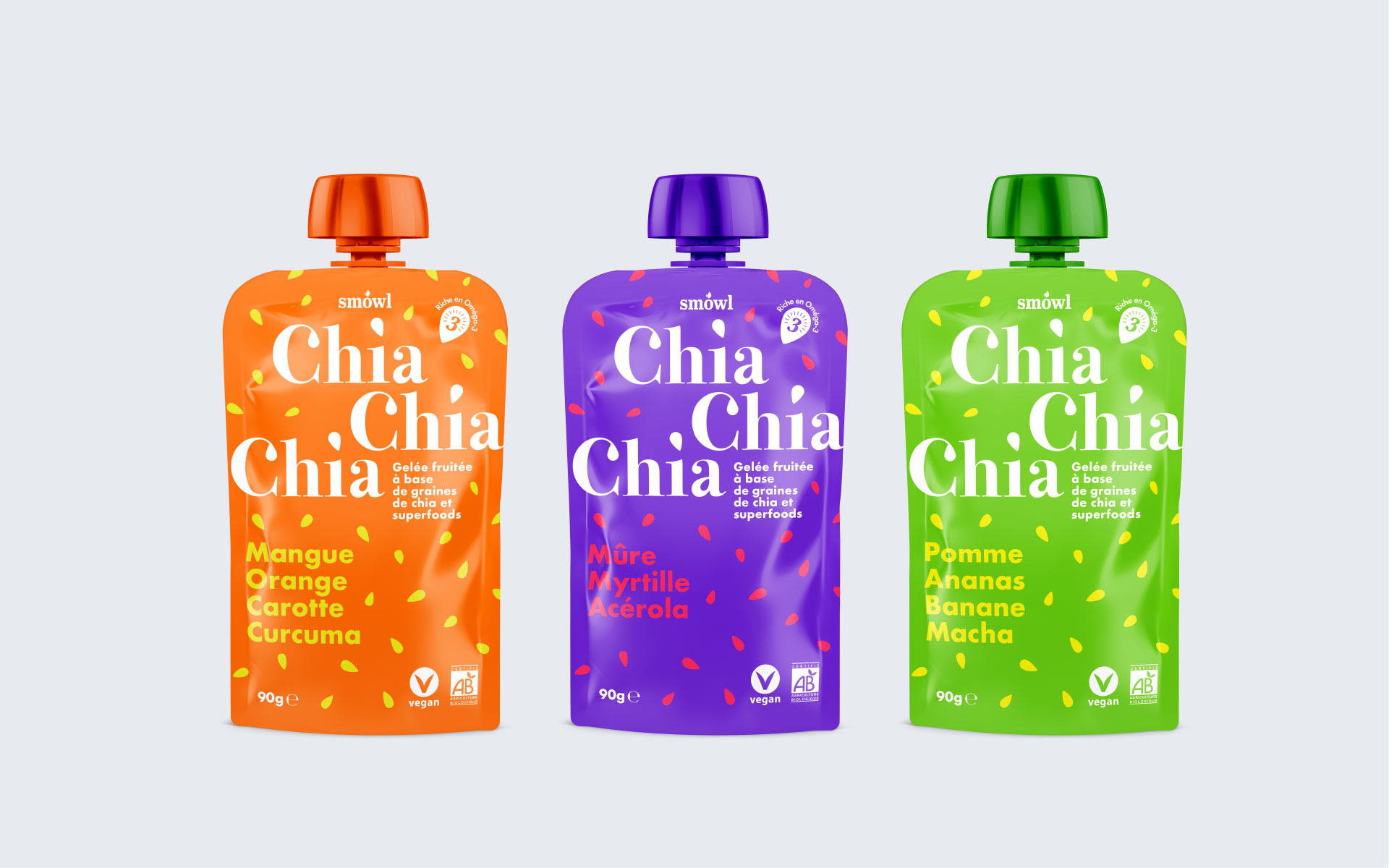
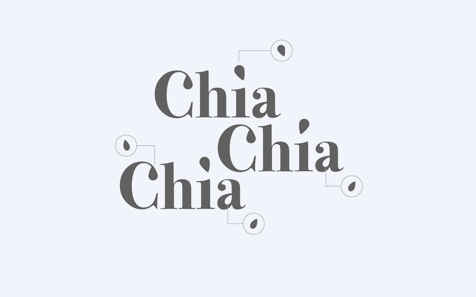
Next, the product range identity was designed. The target market for this product being young mothers, both active and dynamic, implied a need for sophistication. It was also important to maintain a colorful and spontaneous personality. The colors inform customers about the flavors of each variant and underline the richness in taste. The name of the product, 'Chia Chia Chia' uses elegant typography while maintaining some generosity. Seed shapes have been subtly interwoven in the writing as well as on the dots of the letters 'i' to create dynamism and personality.


Design a cohesive set of packaging with bold and original personalities.